With Windows 11, Microsoft is adding a number of new design features and more improvements are expected to land in the coming days via the Microsoft Store. At the same time, Microsoft is killing off features it thinks aren’t being used.
Microsoft has already posted a list of deprecated Windows 11 features that give us a glimpse of what could be getting removed later this year. Perhaps the most noticeable feature that’s no longer being developed is Windows Timeline which is currently accessible through Task View and lets you travel back in time to find previous files.
With Windows 11, Microsoft is also downgrading the taskbar experience. A lot of basic functionalities are no longer available. For example, taskbar location cannot be changed and a full-fledged right-click menu for the taskbar has been removed from the operating system.
Windows Taskbar
According to the official documentation, these taskbar features are no longer available (depreciated):
- People app icon has been removed from the taskbar.
- Some icons may not appear in the System Tray (systray).
- Taskbar alignment (location) is now bottom of the screen and it cannot be changed
- The taskbar has been rewritten and third-party apps will have limited access to the APIs. As a result, apps can no longer customize some areas of the taskbar.
Microsoft has also removed some other features.
Taskbar right-click menu is missing
As mentioned at the outset, Microsoft is removing the context menu (right-click menu) for the taskbar and users are clearly not happy.
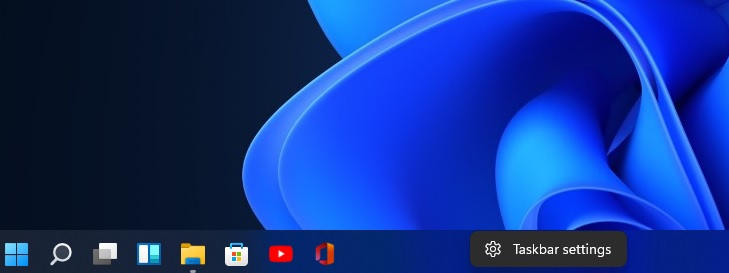
In a Feedback Hub post, a user wrote:
There is a massive decades-old legacy of internal corporate documentation that leverages the simple right-click on the taskbar to access the task manager to troubleshoot issues. This shortcut not only make absolute sense but removing it creates massive corporate cost.
Microsoft responded to the feedback and confirmed that this is the new behaviour in Windows 11:
Thank you so much for giving us your feedback. While we’ll continue to use your feedback to guide the future of features like this, currently on Windows 11, you can right-click the Start menu button to quickly open the Task Manager. In addition, you can also press CTRL + SHIFT + ESC to open Task Manager directly.
Drag-and-drop support and taskbar size
As we reported recently, Windows 11 has also dropped support for drag-and-drop.
Microsoft officials have confirmed that the new modern operating system doesn’t allow users to drag and drop files onto the taskbar to open in another app. Similarly, we can no longer drag and drop apps or shortcuts onto the taskbar.
If you try to drag a file onto an app on the taskbar, it will not open in the highlighted application.
In Windows 10, you can place your mouse at the top edge of the taskbar and simply drag it to resize. This is no longer possible in Windows 11. If you want to change the taskbar size, you need to rely on three sizes: small, medium and large. In the preview builds, users can only change the size of the taskbar by modifying the registry.
Taskbar labels
Windows 11 will hide the taskbar button labels and app windows will be always combined for a clean interface.
“As a user who has several applications open often with multiple windows I’ve always had the Taskbar on the right side of my screen so that I could switch between them with ease. The new “Always Combined and at the Bottom” is absolutely Killing my workflow,” a user wrote in the Feedback Hub.
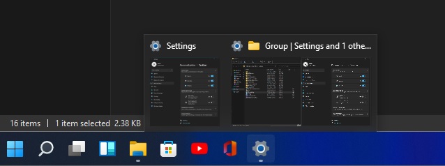
Similarly, some programs like Steam will show multiple Steam icon bubbles for things like the main window, the friends list, and anything else open.
“Sometimes they’ll combine, sometimes not, but it would be nicer to just have them as separate entries with the text like the old school style,” another user wrote.
Quick Settings gesture
In Windows 11, Action Center has been replaced with two separate features – notification center and Quick Settings.
At the moment, Quick Settings doesn’t support gestures, so if you’re a tablet user and the app is open in fullscreen mode, you need to access the taskbar with the left swipe and tap on the taskbar in order to open the Quick Settings.
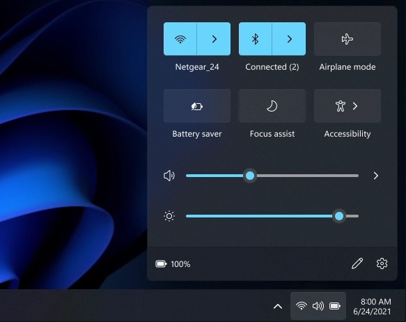
For tablet users, lack of basic gestures could disrupt their workflow. That’s because users cannot slide from the bottom of the screen to access Quick settings like brightness, Bluetooth or aeroplane mode.
The right swipe is now reserved for the notification center and calendar flyout.
“That should be essential for tablets. You can’t access the taskbar when using fullscreen apps (e.g. YouTube) so you can’t access Action Center (quick settings) at all on tablets without minimizing the app,” a user noted in Feedback Hub post which has been upvoted by nearly 200 users.
Desktop wallpaper roaming
Windows 11 will no longer allow users to sync their desktop background across devices when signed in with a Microsoft account.
Windows apps
Cortana is not included in the first boot experience and the following apps are no longer pre-installed:
- Math Input Panel
- Wallet
- 3D Viewer
- OneNote for Windows 10
- Paint 3D
- Skype
Start Menu customization limited
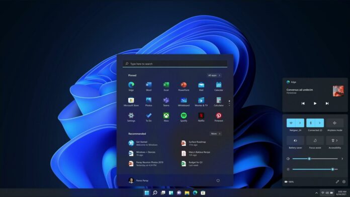
Start Menu has been redesigned in Windows 11. It no longer features live tiles and it’s also no longer possible to create folders of apps, a feature that was previously offered with Windows 10X (a cancelled operating system).
The layout is also not resizable. If you want to make any changes to the size of the Start, you need to change the system’s scaling settings.
Windows 11 Start Menu also comes with a new “recommendations” section which shows a list of apps/files recently accessed on the device or cloud. Unfortunately, it is not possible to remove or collapse the “recommendations” section.
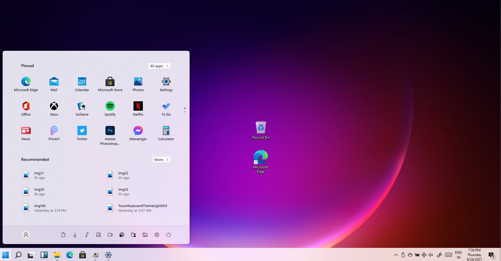
“I find the Recommended section to be pretty useless especially on a home computer where the files you open are more abstract than at work. And the section eats up half of the start menu basically giving it the same importance as the pinned icons section. I would rather have more space for pinned icons,” a user noted in the Feedback Hub.
If you really want to hide the recommendations, go to Settings > Personalization > Start and turn off the Show recently added apps and/or the Show recently opened items option, but this will not remove the section entirely.
A Microsoft employee confirmed that the feedback has been shared with the team, but it’s not yet clear if and when these features will be restored.

0 Comments
Thanks for being here, let us know if you have any question.